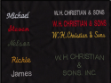
When it comes to the description of the letting on the belt I believe it's called "engraving" not embossed as Hart specifies. Not that it makes a difference but it's good to know.
I also found a font called, "Growler" which I believe looks like the font used.
Growler font
The company that supplies this type of font could be Summitsoft. There is a package collection called, "Pro Master" that I believe includes this type of font but there are over 7,000 fonts included and one would need to purchase.
FontPack Pro Master Collection | #1 Selling Master Font Collection
If this belt was engraved, I believe they would print out the template and use an engraving tool over that. So perhaps someone with knowledge of engraving would be helpful to learn more?

")